These are a few of the web site elements, I cant show the whole site pages or my finished products as thats the rules with the D&AD brief, there will be full mock ups in my sketch book and all assets like the web site will all be explained in a final video and possibly some informative boards.
Showing posts with label D and AD. Show all posts
Logo - Texture
Labels:
D and AD
/
I have added some texture and while doing this played around with back ground noise, Im definitely using this with in the web site design as i feel it softens it a lot and also helps tie every thing in with paper. I need to make more element for the web site using the same type and paper background so its all consistant and works together to form the Words of Wisdom brand.
Logo
Labels:
D and AD
/
This is my chosen logo, it has two different types but they are from the same family. I wanted hand drawn elements with cleanness. This looks to clean and sharp for now.
logo development
Labels:
D and AD
/
Above are some logo ideas for my WORDS OF WISDOM idea, i like the house industrie type as apose to the bebus and carossie mock ups. It needs some more thought but im definitely not using butter milk or two contrasting types within the logo. I want to have a kind of hand drawn feel about it but not to hand drawn or stylized as it does have to represent a blank sheet or fresh start.
Color Theory
Labels:
D and AD
/
Color occurs when light in different wavelengths strikes our eyes. Objects have no color of their own, only the ability to reflect a certain wavelength of light back to our eyes. As you know, color can vary in differing circumstances. For example, grass can appear gray in the morning or evening or bright green at noon. Colors appear different depending on whether you view them under incandescent, florescent or natural sunlight. Colors also change according to their surroundings. You can see this by looking at the color squares below - the reddish outline box is the same color in all the examples.
Color value refers to the lightness or darkness of the hue. Adding white to a hue produces a high-value color, often called a tint. Adding black to a hue produces a low-value color, often called a shade.
Intensity
Intensity, also called chroma or saturation, refers to the brightness of a color. A color is at full intensity when not mixed with black or white - a pure hue. You can change the intensity of a color, making it duller or more neutral by adding gray to the color. You can also change the intensity of a color by adding its complement (this is the color found directly opposite on the traditional color wheel). When changing colors this way, the color produced is called a tone.
When you mix complementary colors together, you produce a dull tone. However, when you put complementary colors side by side, you increase their intensity. This effect is called simultaneous contrast - each color simultaneously intensifies the visual brightness of the other color.
Harvard refrence;
Bonnie Skaalid. (1999). Elements of Design. Available: http://www.usask.ca/education/coursework/skaalid/theory/cgdt/color.htm. Last accessed 20th Feb 2011.
Hue
Hue refers to the color itself. Each different hue is a different reflected wavelength of light. White light broken in a prism has seven hues: red, orange, yellow, green, blue, indigo and violet. White light occurs when all the wavelengths are reflected back to your eye, and black light occurs when no light is reflected to your eye. This is the physics of light.When it comes to using color in art, things get quite messy. Looking at the color wheel above, when using color pigments, the three primary colors used are yellow, blue and red. These three colors are blended together to produce other colors, called secondary colors, such as green, orange and purple. Mix enough colors together, and you get black. Pretty strange, eh?
Computer colors
Computer colors are produced by combining the three colors of red, green and blue together. Believe it or not, you can get yellow by combining these colors (I've never been able to figure out why, but you can!)
Print colors
Things get even dicier on computers when you go to print out these colors. Printing uses the CYMK convention which takes cyan (light blue), yellow, magenta (pinky red) and black inks and tries to recreate the color that your computer created with red, green and blue light.
Color Value
Color value refers to the lightness or darkness of the hue. Adding white to a hue produces a high-value color, often called a tint. Adding black to a hue produces a low-value color, often called a shade.
Intensity
Intensity, also called chroma or saturation, refers to the brightness of a color. A color is at full intensity when not mixed with black or white - a pure hue. You can change the intensity of a color, making it duller or more neutral by adding gray to the color. You can also change the intensity of a color by adding its complement (this is the color found directly opposite on the traditional color wheel). When changing colors this way, the color produced is called a tone.
When you mix complementary colors together, you produce a dull tone. However, when you put complementary colors side by side, you increase their intensity. This effect is called simultaneous contrast - each color simultaneously intensifies the visual brightness of the other color.
Harvard refrence;
Bonnie Skaalid. (1999). Elements of Design. Available: http://www.usask.ca/education/coursework/skaalid/theory/cgdt/color.htm. Last accessed 20th Feb 2011.
Mike Crozier
Labels:
D and AD
/
"My name is Mike Crozier. I am a 22 year old creative studying in Leeds, UK.
I practice primarily in Graphic Design, Illustration and Animation, although I have been known
to dabble in many other creative fields, and would hate to limit myself to these three disciplines.
I have a fascination with line drawings, wooly hats, and things made from paper."
I practice primarily in Graphic Design, Illustration and Animation, although I have been known
to dabble in many other creative fields, and would hate to limit myself to these three disciplines.
I have a fascination with line drawings, wooly hats, and things made from paper."
The above images and video's are all by Mike Crozier who made the previous video i just blogged, i really rate his work and love his graphic style. the paper cut out is a good idea and relevant to my previous research. I didn't mention it before ut his use of sound mainly apparent in the previous video is very very good and really helps make the video. when producing animation based work i think sound should be considered a very important aspect of it.
SNASK
Labels:
D and AD
/
I really love this stop frame video and also love the fact that it has been made purely by paper. some really nice touches to this video and all made using very accessible techniques and technology.
SNASK from Mike Crozier on Vimeo.
" Stopmotion film that I created for SNASK while interning with them in Stockholm.
I wrote, shot and edited the film myself without the use of special effects or stopmotion software.
There are 1846 photos, and it took just under 4 days to shoot.
For more information go to croz.co.uk or cargocollective.com/croz "
SNASK from Mike Crozier on Vimeo.
" Stopmotion film that I created for SNASK while interning with them in Stockholm.
I wrote, shot and edited the film myself without the use of special effects or stopmotion software.
There are 1846 photos, and it took just under 4 days to shoot.
For more information go to croz.co.uk or cargocollective.com/croz "
KEY WORDS
Labels:
D and AD
/
I have listed a few key words from the ArjoWiggins brief that i felt are important. I will be keeping these words in mind when continuing to develop ideas that answer the brief correctly.
Handmade Nation: stop animated opening title sequence
Labels:
D and AD
/
The opening sequence to Handmade Nation was shot in August 2008 at Radar Studios in Chicago, IL. This is the opening title sequence for the featured length documentary Handmade Nation (to be released in 2009). This sequence of stop animation was in 26 hours over the course of a 2 day "weekend". The original score "Hands On" was composed by Joe Wong and Didier Leple (www.noisola.com), vocals by Annie Killelea and Zach Peiper.
Director: Sam Macon
Art Director: Faythe Levine
Producer: Jonah Mueller
Creative Assistant: Annie Simeone
Original Music: Noisola.com
Labels:
D and AD
/
Im looking at video styles, stop motion in particular as thats what i have mainly worked with in the past on previous projects. I looked more in to tilt shift stop motion as it is some thing i have played with briefly.
I love this music video, i think its a really original approach and also very entertaining to watch, the use of the tilt shift is the bit i am mainly interested in. it works well and gives a real interesting effect. i like the pans and zooms with in the shots as well. this makes each shot a bit more exciting.
The above video is another look at tilt shift time lapse. there is some amazing shots in here. the tilt shift time lapse works well in very busy areas and the speed is usually faster than real time but not to fast. the music works well with this but to slow paced for what speed i need to be thinking in. one of my favorite shots is the boat on water also the Eiffel tower area.
I stumbled across this when searching the pages of vimeo. i think the start of this is very strong compared to the middle and end. it gets to slow and boring. the use of split screen works well because it essentially is giving you three bits of information instead of one. this could be a useful technique if your making only a short film. the shot where it was split up in to three and the content was all cloud shots worked well.
I have done some general research on tilt shift and some people have been using after effects, bellow is a quote i found that explains the process.
"I brought the clip into AE and made it 3D. Then I added a camera with the depth of field ON. I tilted the video back on the X-axis about -45 degrees. then i added a corner pin effect and brought the corners in to correct for the skewed angle and make it fill the frame. Then if you increase the aperture and mess with the focal distance, you pretty much got it."
I personally think its worth having a go at this, i plan to have a play around using this effect in after effects to some footage as its some thing i have done manually in the past.
I love this music video, i think its a really original approach and also very entertaining to watch, the use of the tilt shift is the bit i am mainly interested in. it works well and gives a real interesting effect. i like the pans and zooms with in the shots as well. this makes each shot a bit more exciting.
The above video is another look at tilt shift time lapse. there is some amazing shots in here. the tilt shift time lapse works well in very busy areas and the speed is usually faster than real time but not to fast. the music works well with this but to slow paced for what speed i need to be thinking in. one of my favorite shots is the boat on water also the Eiffel tower area.
I stumbled across this when searching the pages of vimeo. i think the start of this is very strong compared to the middle and end. it gets to slow and boring. the use of split screen works well because it essentially is giving you three bits of information instead of one. this could be a useful technique if your making only a short film. the shot where it was split up in to three and the content was all cloud shots worked well.
I have done some general research on tilt shift and some people have been using after effects, bellow is a quote i found that explains the process.
"I brought the clip into AE and made it 3D. Then I added a camera with the depth of field ON. I tilted the video back on the X-axis about -45 degrees. then i added a corner pin effect and brought the corners in to correct for the skewed angle and make it fill the frame. Then if you increase the aperture and mess with the focal distance, you pretty much got it."
I personally think its worth having a go at this, i plan to have a play around using this effect in after effects to some footage as its some thing i have done manually in the past.
Androids
Labels:
D and AD
/
Het Klokhuis - Johnny Kelly
Labels:
D and AD
/
"Het Klokhuis" Opening titles from Johnny Kelly on Vimeo.
Stop motion title sequence for Dutch science show "Het Klokhuis" (The Apple Core). It is Hollands oldest youth television show, covering everything from the history of dinosaurs to how an iPhone is made.
This was commissioned by advertising agency Kesselskramer, produced at Nexus Productions, and was made in collaboration with model maker / sculptor Jethro Haynes. The apples and core models were built using 3D printing technology in order to maintain the logo shape.
Client: NPS
Agency: KesselsKramer
Creative Team: Christian Borstlap
Agency Producer: Pieter Leendertse
Production Company: Nexus
Director: Johnny Kelly
Executive Producers: Christopher O'Reilly & Charlotte Bavasso
Producer: Luke Youngman
Production Manager: Jo Bierton
Creative Development: Beccy McCray
Model-maker: Jethro Haynes
3D printed model design: Ben Cowell, Matt Clark
Animators: Matthew Cooper, Tine Kluth
Runner: Xaver Böhm
Compositing: Alasdair Brotherston
Director of Photography: Matthew Day
Filmed at Clapham Road Studios
Music: Harry Bannink
Sound Design: FC Walvisch Amsterdam
nexusproductions.com
mickeyandjohnny.com
jethrohaynes.com
matthewcooperfilm.com
kesselskramer.com
christianborstlap.com
Amber Dodds
Labels:
D and AD
/
Amber Dodds creates 3D handmade playing cards out of other playing cards, These look real good. yet more interesting paper objects i seem to be gravitating towards.
David Airey - Universal wrapping paper
Labels:
D and AD
/
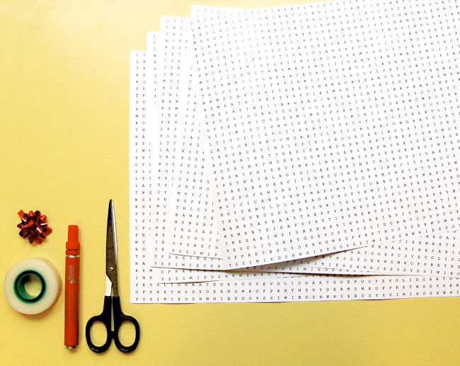
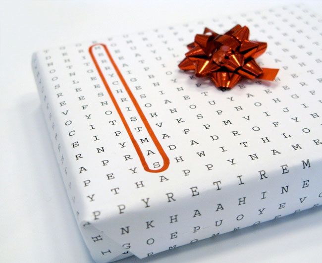
I stumbled across this universal wrapping papper while searching paper related things, I found it such a simple an obvious idea yet still so interesting and effective.
D&AD - Arjo Wiggins
Labels:
D and AD
/
I have decide to tackle the Arjo Wiggins blank sheet brief for my D&AD project. I will now begin only research relevant for this project and around my brain storms in my sketch book.
Max Mörtl
Labels:
D and AD
/
I came across a maker and creator called Max Mörtl, I was really inspired by his portfolio and loved looking at his work. most of it is completely achievable as well. He works in video and mainly in stop motion using paper objects or clay as his medium. bellow is his fantastic show reel. some of his work marries the origami shapes i have been looking at with animation perfectly.
This is a cool behind the scense video, its really instresting watching how they made the video, no 3-d software was used, purpley stop motion and patience. amazing.
and the final film is below;
S SSYP from Max Moertl on Vimeo.
S SSYP is an experimental stop motion animation, an interaction of sound and flow. Abstract forms become alive and deform themselfs in different ways of movement.
watch making of here: www.vimeo.com/10866084
Animation: Max Mörtl, Robert Loebel, David Grüner
Sound: Julian Terbuyken
Hamburg 2009
www.maxmoertl.de
www.robertloebel.com
This is a cool behind the scense video, its really instresting watching how they made the video, no 3-d software was used, purpley stop motion and patience. amazing.
and the final film is below;
S SSYP from Max Moertl on Vimeo.
S SSYP is an experimental stop motion animation, an interaction of sound and flow. Abstract forms become alive and deform themselfs in different ways of movement.
watch making of here: www.vimeo.com/10866084
Animation: Max Mörtl, Robert Loebel, David Grüner
Sound: Julian Terbuyken
Hamburg 2009
www.maxmoertl.de
www.robertloebel.com
what brief?
Labels:
D and AD
/
I have got it down to 2 potential briefs to work on, they are the following;
Arjo Wiggins or Diesel
--Diesel
Create an illustrated interpretation of a musical track that is experienced by the viewer in an unconventional and pioneering way
--Arjo Wiggins
Create a viral movement amongst designers that unbreakably links Arjowiggins Creative Papers with creativity and the creative design process.
I like the challenge of the Diesel brief as i feel i have read it well and they are asking for some thing completely different, in a way a reinvention of music illustration. I think my initial ideas of user generated artwork could be good for this. I can myself taking this further and producing web site mocks and how it could be integrated within social media.
With the Arjo Wiggins brief i am fond of the broadness, it is a very hard brief as ive really looked deep in to it and the viral nature they are looking for adds a completely different level on things in terms of my initial ideas. I was keen to do a stand alone animation for this or a really fun stop motion but that really isnt what they are looking for. im going to give both these briefs a bit more thought and decide wich one i will take further.
Arjo Wiggins or Diesel
--Diesel
Create an illustrated interpretation of a musical track that is experienced by the viewer in an unconventional and pioneering way
--Arjo Wiggins
Create a viral movement amongst designers that unbreakably links Arjowiggins Creative Papers with creativity and the creative design process.
I like the challenge of the Diesel brief as i feel i have read it well and they are asking for some thing completely different, in a way a reinvention of music illustration. I think my initial ideas of user generated artwork could be good for this. I can myself taking this further and producing web site mocks and how it could be integrated within social media.
With the Arjo Wiggins brief i am fond of the broadness, it is a very hard brief as ive really looked deep in to it and the viral nature they are looking for adds a completely different level on things in terms of my initial ideas. I was keen to do a stand alone animation for this or a really fun stop motion but that really isnt what they are looking for. im going to give both these briefs a bit more thought and decide wich one i will take further.
origami - my own attempt
Labels:
D and AD
/
I made my own t shirt out of some money (£10 note), by following a video i found on you tube i realised its not actually that hard. seeing this process animated would look pretty good and is definitely worth exploring. After this experiment i now am confident that i can make some thing good out of paper. I need to develop an idea that uses paper in this way interestingly if i was to use origami in my project. Animation could be the way.
origami - money
Labels:
D and AD
/
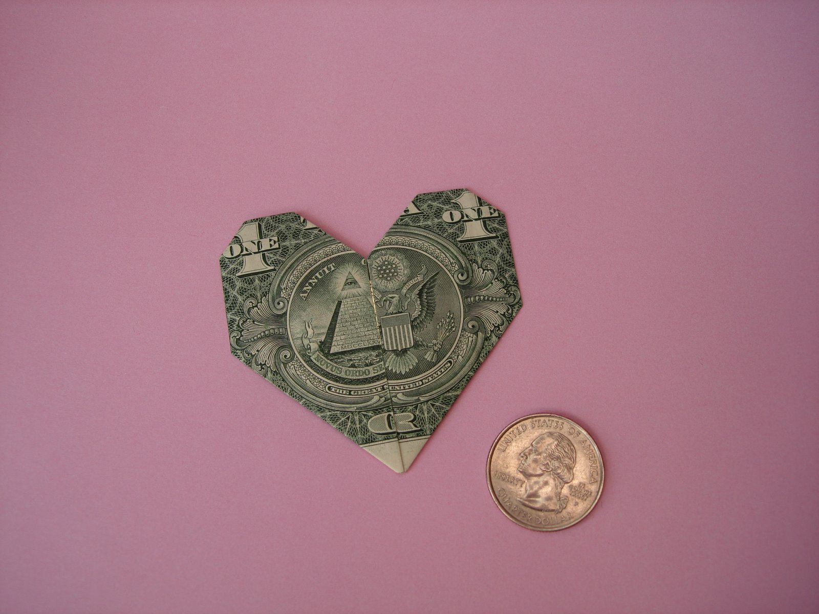
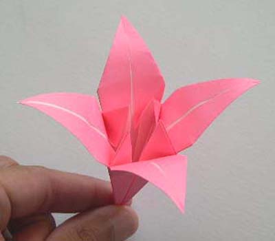
After the Origami research i then found lots of money origami, i really found these interesting to look at and think there again is potential with in this to use for some thing wether it be in a video or print response.